


Project Overview
Dr. ForHair began its journey as a specialized scalp care center in 2012, and in 2014, it introduced ‘Dr. FORHAIR’ hair care products, earning positive recognition as an expert in the dermato-trichology scalp/hair care market. Leading the category, the brand has been acknowledged for its professional value.
However, in recent years, with the proliferation of similar namings and an oversaturation of the derma category, there has been a recognition of diminishing distinctiveness. Acknowledging the need to strengthen the brand’s differentiation, this project was initiated.
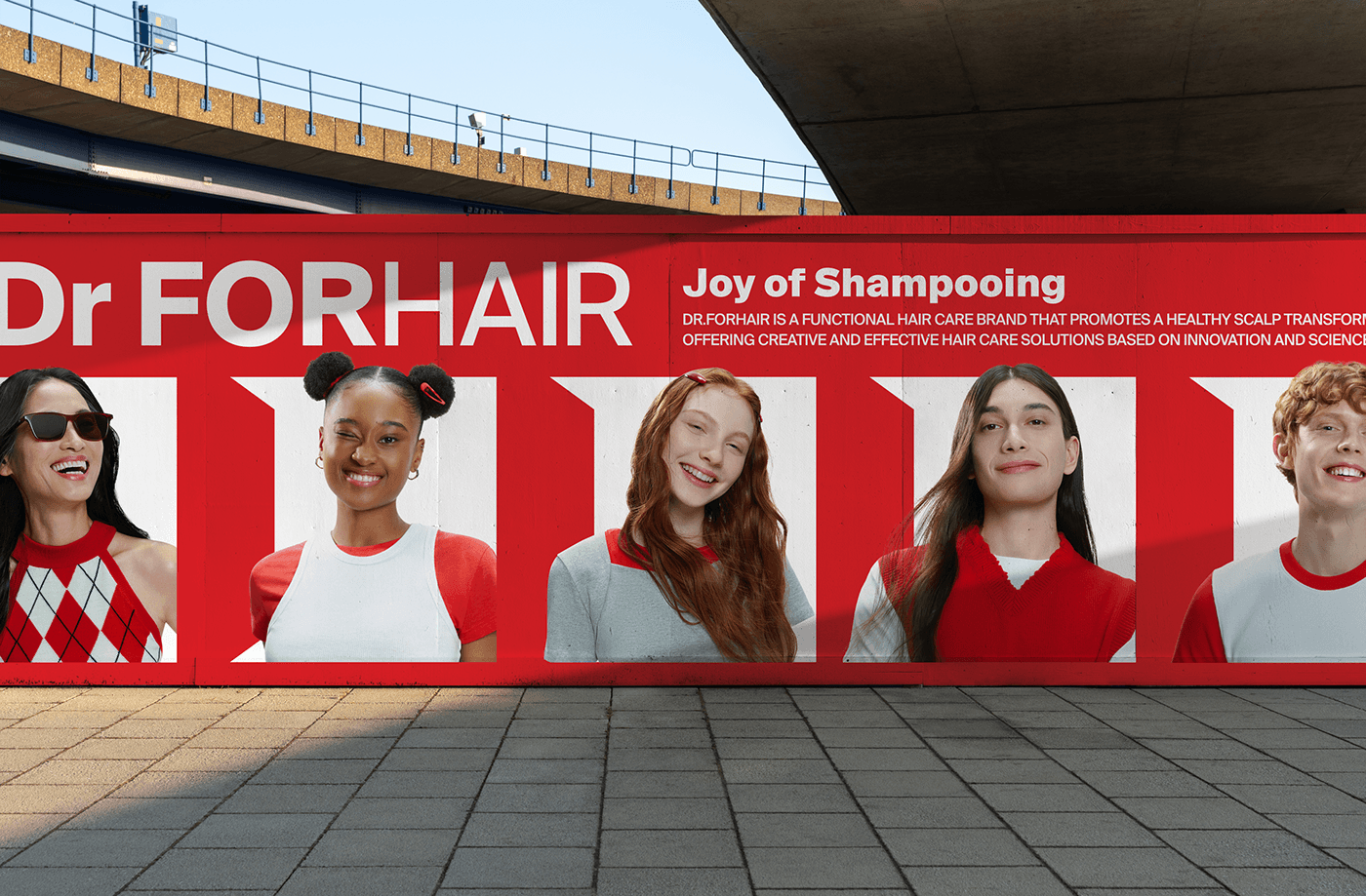
To create a noticeable distinction in the market, the project aims to elevate the design completeness, visually enhance the brand image, and design a new brand look based on a consistent message to establish a likable brand image. While maintaining the brand’s expertise in scalp care, a focus is placed on correcting Dr. ForHair’s visual language to convey a delightful and enjoyable mood from an experiential perspective, crafting a sensory brand language and visual grammar unique to Dr. ForHair.
닥터포헤어는 2012년 전문 두피관리센터를 시작으로 2014년 ‘Dr. FORHAIR’ 헤어케어 제품을 출시하며 더마톨로지 두피/탈모 케어 시장에서 전문가적 가치를 긍정적으로 평가 받으며, 카테고리를 선도해왔습니다.
다만, 최근 몇 년간 유사한 네이밍과 더마 카테고리가 과도해지며 차별성이 낮아짐을 인식하고 브랜드만의 차별화 포인트를 강화할 필요성을 느끼며 본 프로젝트를 시작하게 되었습니다.
시장에서 눈에 띄는 차별화를 만들기 위해 국내외 시장분석에 따른 전략 방향을 도출하고 전략에 따른 비주얼아이덴티티를 개발했습니다. 일관된 메세지를 기준으로 새로운 브랜드 룩 설계를 통해 호감도 높은 브랜드 이미지 구축을 목표로 설정했습니다. 브랜드가 오랜 시간 쌓아올린 자산이었던 두피에 대한 전문성은 유지하고 경험적 측면에서 즐겁고 유쾌한 무드를 전달하기 위해 닥터포헤어만의 시각언어를 교정하여 감각적인 브랜드 언어와 시각 문법을 설계합니다.

Brand Logo
Wordmark & Symbol
The existing wordmark utilised a grotesque typeface to express professionalism and a serious attitude, but the glyphs of certain alphabets and the contrast between the curved surfaces and hollow spaces made it difficult to break out of the conservative impression. To overcome these issues, the wordmark was designed to have a cleaner look, with corrected silhouettes and more hollow space to clearly show the weight differences between letters, but without being stuffy.
기존에 활용되던 워드마크는 전문성을 표현하고 진중한 태도를 표현하기 위해 그로테스크 서체를 활용했으나, 특정 알파벳들의 글리프 및 곡면과 속공간의 대비 등으로 인해 보수적인 인상을 벗어하는데 한계점이 있었습니다. 이러한 문제를 개선하기 위해 보다 클린한 인상을 가지도록 워드마크의 실루엣을 교정하고 속공간을 확보하여 글자 별 웨이트 차이는 명확하게 표현하되, 답답하지 않은 인상을 제공할 수 있도록 디자인되었습니다.


Brand Graphic Language
to express your brand essence
We decided that Dr. Forhair's expertise is not just the result of thinking behind closed doors, but that the brand's unique value and differentiation from competitors is manifested in the diagnosis and clinical data of numerous scalp care centres and qualified experts at home and abroad.
In order to intuitively convey these brand values, we started with the brand essence of 'Opening the door and facing the field' and established the brand's own visual language to consistently convey the sequence of the brand and customers facing each other through various media, starting with the motif of the door opening in the closed lab and beyond. We developed sustainable brand assets by establishing a proportional system to respond to various areas from online to offline packages.
우리는 닥터포헤어의 전문성이 단순히 문닫힌 연구실에서 고민한 결과물이 아닌, 국내외 수많은 두피 관리 센터와 자격을 갖춘 전문가의 진단과 임상자료에서 경쟁사와의 차별성과 브랜드 고유의 가치가 나타난다고 판단했습니다.
이러한 브랜드의 가치를 직관적으로 전달하기 위해 ‘문을 열고 현장을 마주하다.’라는 브랜드 에센스를 시작으로 꽉막힌 연구실의 문이 열리는 형상을 모티프로 삼고 그 너머에서 브랜드와 고객이 마주하는 시퀀스를 다양한 매체를 통해 일관되게 전달 할 수 있도록 브랜드 만의 시각 언어를 정립했습니다. 온라인부터 오프라인 패키지까지 다양한 영역에서 반응 할 수 있도록 비례 시스템을 정립하여 지속가능한 브랜드 에셋을 개발했습니다.


※ Content provided by Dr.FORHAIR 실제 사용된 이미지는 Dr.FORHAIR 기획/제작하였습니다.


